
City Pups!
A fun, interactive app to help city dwellers adopt the perfect pup!
UX Writing- Design Sprint
Picture this
You live in the city and yearn for a dog. You’ve been to many shelters to find the perfect dog to adopt, but you seem to fall in love with the pups who aren’t practical for your lifestyle. You have a small apartment, no car and live on the 30th floor. How can you find the perfect pup?
Context
Product and Audience
City Pups! is a mobile app designed to help urbanites find the perfect pup. City dwellers have unique challenges when owning a pet: transportation restrictions, small living spaces and limited outdoor areas. City Pups! is made for people who live in an urban area and want to adopt a dog.
My Role
As a design sprint bootcamp project, I was the UX writer and designer for a mobile app created for a start-up named City Pups. The project lasted 5 days and was created using Figma. My major contributions:
Reviewed the research supplied by City Pups including personas and user testing.
Chose language for the app.
Maintained the voice and tone of City Pups.
Wrote a questionnaire so the algorithm recommended pups based on essential criteria: size, personality, space needs and transportation requirements.

Challenges
People who live in cities have unique circumstances that can make finding the perfect dog difficult. The goal of this app is to allow users to narrow down their search according to their individual needs.
Getting users excited to adopt a pup.
Finding an efficient and accurate way for users to communicate their dog requirements.

Approach
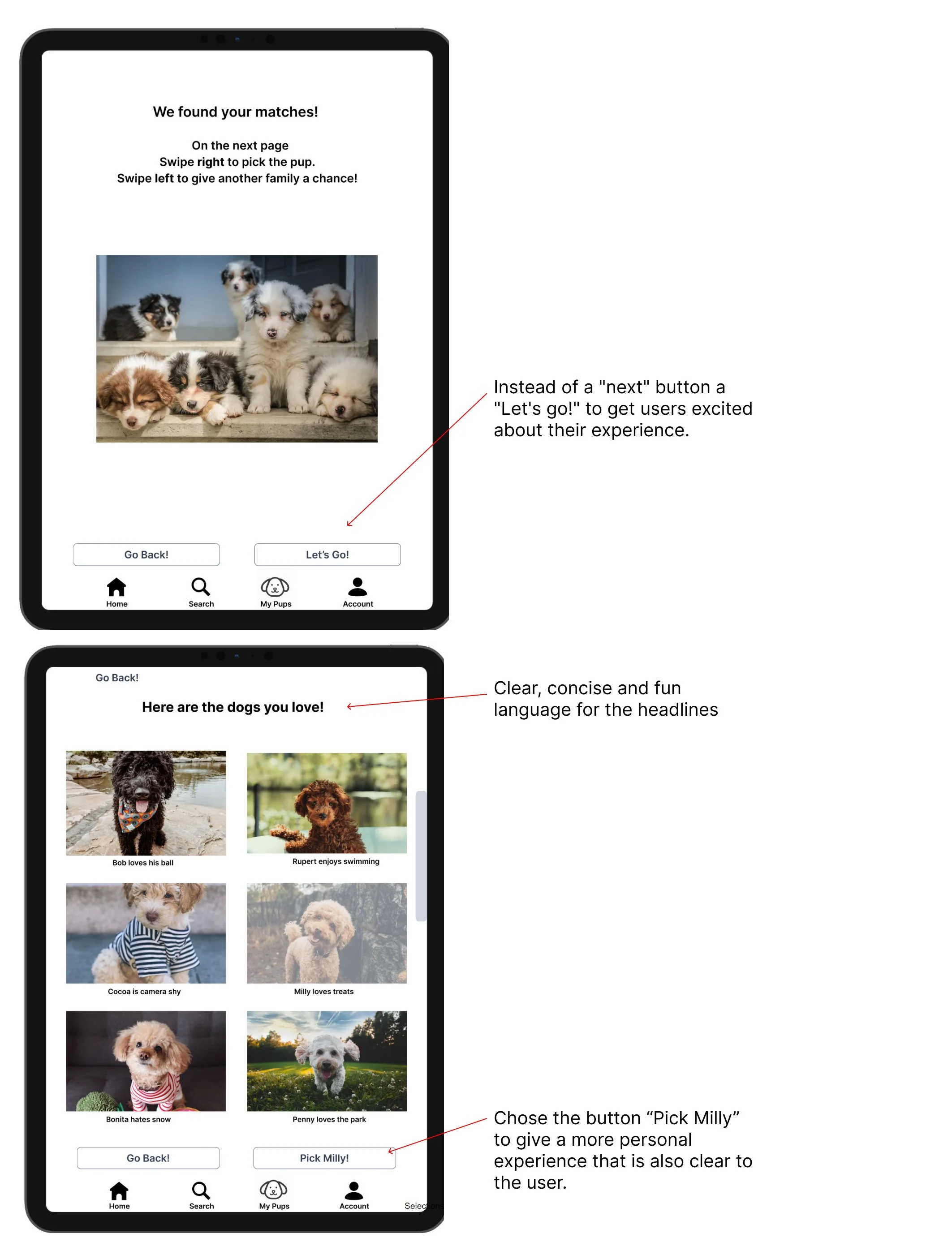
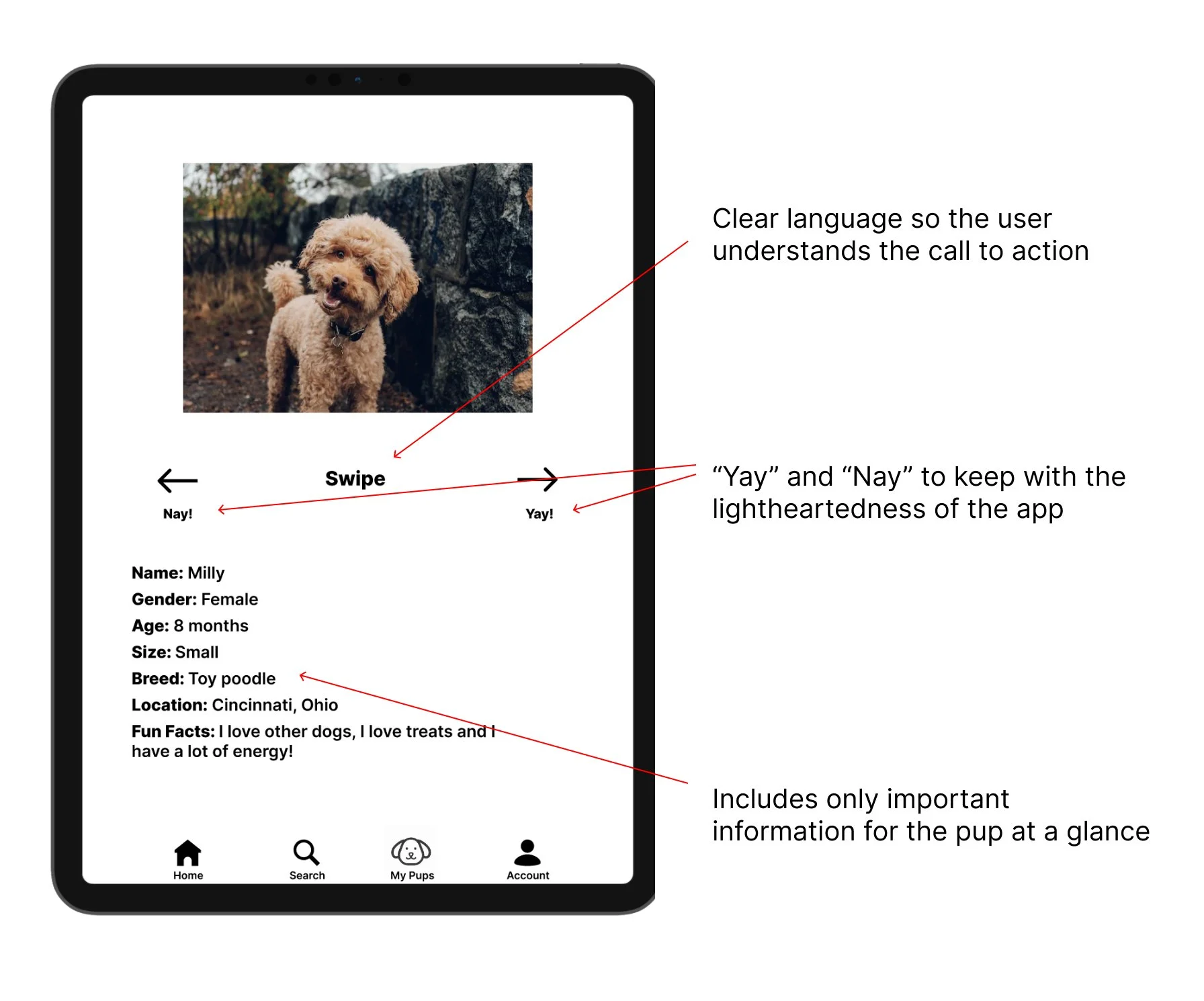
Use microcopy and fun language so users love the app and enjoy the process.
Write a personalized questionnaire that addresses all the important factors to consider when adopting a dog in a city setting.
Create clear and concise descriptions of the pups with accurate contact information.
Exploratory Research
Researched the company and the users
Got to know City Pups and the challenges users were having finding a dog while living in a city.
Reviewed & dog adoption apps and websites for inspiration.
many apps focused on filtering geared toward the dog and not the user.
Typical filters were available such as dog size and dog breed but lacked the ability to select dogs based on need for space or transportation limitations.
Reviewed the personas, user interviews and comments made by users to determine tone and voice.

The questionnaire
Wrote a questionnaire with questions geared toward the user to filter out dogs that wouldn't be a good fit.
Usability Testing
User testing with fully functional, high-fidelity prototype of the flows developed using Figma to test 5 users to determine what worked for the app and what did not.
Discovery #1
Problem 1
There was not enough consistency when using the button.
Users would select an image in order to get to that dog's profile but did not understand this process. Many would look for a button to click once the dog was selected and there was not a button.

Solution 1
Added a button.
I added a "meet pup" button and personalized it so the selected pup's name would appear on the button. This worked great because users had already learned to click the button to continue in the process.
Discovery #2
Problem 2
Users swiped on arrows and not the picture.
In the initial prototype, if the user swiped right on the dog it would be saved to "my pups" and a left swipe would remove the dog from the search. However, users were swiping on the arrows and that did not allow them to complete the process.
Solution 2
User may choose to swipe on either the dog or the arrow.
I reiterated the screen and linked both the image and the arrows to the dog's profile page. I also shrunk the size of the text so the user would not automatically swipe that first and instead would swipe on the picture.

Discovery #3 & Discovery #4
Problem 3
Users did not scroll vertically on the search page.
Originally, the prototype did not have the layout that would indicate there would be multiple more dogs should they scroll down.
Solution 3
I updated the UI to show there were more pups to view.
I updated the search screen and added partial pictures to show the capacity to scroll vertically. Users then understood that there were more dogs available to view.

Problem 4
The dog icon confused users.
The dog icon on the navigation bar in the first iteration was not recognized as a dog. Although some knew it was a dog during the recap portion of the interview, users were confused.
Solution 4
I inserted a better icon
An easy fix for the confusion was to find a better dog icon. Once I updated the icon, users were better able to go to the page for saved dogs.
UX Copy
Word choices
Fun and casual vibe because adopting a pet should be fun! Stays consistent with the voice and tone of City Pups.
Buttons are informal yet informative with clear and fun text.
Direct language to reduce cognitive load.


Learnings
This case study helped me:
Grow as a writer by being able to play with fun and whimsical words and design concepts.
Find ways to use others’ research.