
Couch Captain
A streaming app that tracks of user progress and show releases
Let me set the scene
You start watching an exciting new show. You can't finish the episode you're on, but you will be able to the next day.
When you return to your living room with a bowl of buttered popcorn, remote in hand, there is one issue. You can't remember on which service you watched your show. You look through Hulu. No luck. Next you check Amazon Prime. Not there. You click on Netflix and IT'S THERE!
But there's a problem. Netflix indicates you haven't even started watching the show! You scroll through the episodes and rewind and fast forward on the latest episode you THINK you watched.
A few weeks later, you're watching Apple TV+ and you see your show exactly where you'd left off weeks ago. Why are you paying for Netflix? Or Hulu?
Context
Product and Audience
Couch Captain is an app that keeps your streaming services in one place, saving you time, money and lots of missed shows and games! As streaming services like Hulu and Netflix replace traditional programming options, it becomes increasingly difficult to keep track of which shows each individual is watching, where he, she or they are in the series, and when new episodes will be released. Couch Captain is a single app that tracks the progress of all streaming services, saves time and money for subscribers, and creates a more positive experience for the watcher!
My Role
My main role for this bootcamp project was the content designer as well as the UI/UX designer and researcher. The project lasted about 12 weeks.
had the chance to engage in the entire UX writing process, contributing to every stage from initial research to the wireframing stage to prototyping and testing and finally, crafting the final UX copy. My specific contributions included:
Writing a screener and user interview questions.
Creating a persona.
Designing the site map.
Conducting A/B user testing.
Refining the UX copy based on testing outcomes.

Challenges
Showing users how much money and time, they can save.
Keeping the app easy and efficient to use because the entire premise of the app is to keep streaming service apps organized.
Using as little text as possible to keep the focus on the images of the shows.
Approach
Reduce the cognitive load for users by guiding them with words through a seamless process so they want to use the app to save time and money.
Less is more when choosing words to keep images the focus.
Exploratory Research
Screener
Wrote screener questions.
Created a screener using Typeform.
Chose participants that met criteria.
Found subjects to solve the problem: How can we help streaming service subscribers stay organized in the easiest way possible?

Interview Guide
User Interviews
Wrote interview script with 7 open-ended questions, focusing on the target user's values, motivations, and daily routines.
Created questions to help participants open up and share their story.
Recruited and interviewed 7 users, in person, and utilized findings throughout the design process.
Conducted user interviews to understand the struggles users with multiple streaming services who watch multiple shows were encountering.
Findings
Many streaming subscribers encounter problems keeping track of their programs.
Users miss sporting events; new episode drops and lose track of where they left off on a show.
Subscribers want to watch shows with friends so they can discuss those programs.
Persona
Based on user interviews and survey.
Gave a deeper understanding of a typical user (goals, needs, experiences, and behaviors).
Updated the persona as more data was received.
Reflected back on this user to make decisions.

Doctor, mom and television watcher
Design Process
User Journey
Wrote a user journey map to identify potential problems and areas of improvement.
Found a few steps that would be better in a different location.*
After updating steps, created a concise flow and a better experience for users.
Tested red routes in first iteration of the design.
Considered Alexa (persona) and thought of her struggle with organizing her streaming services.
*Able to move Alerts to the Accounts section, enabling users to focus more on the shows they were watching and keeping that task separate from the other functions.
Although this map isn't how the flow was designed in the end, it is a good reminder to make sure the flow makes sense to most users and not just what makes sense to me!

Site Map

A/B Testing Results
Onboarding and error screens

Text choices
Reiterated screens basser testing to determine the best language and layout for a positive user experience and reiterated

Before and after screens to show corrections to user pain points after user research
UX Copy
Final Screens
Splash Page

Green indicator for positive input

Red indicator for negative input

Shows

Watch live

Add Apps

Hulu Shows

Show Details

Account

Search for friends

Profile

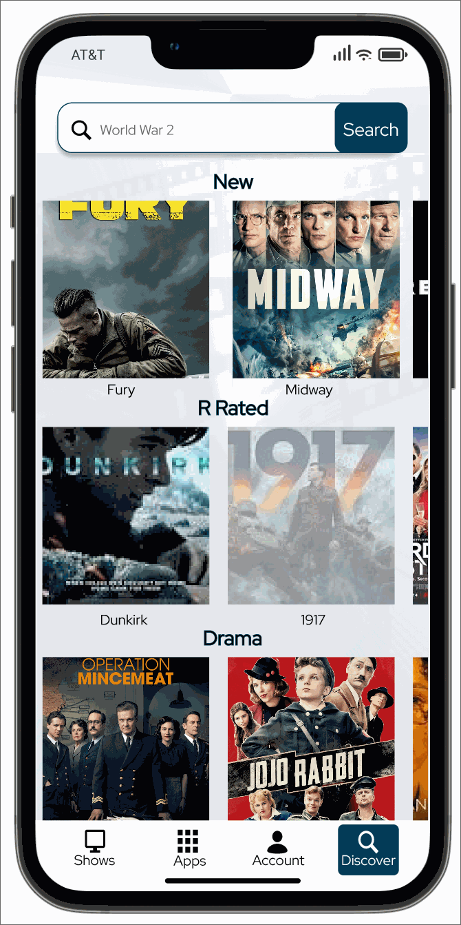
Discover new shows
Learnings
I learned so much by creating the project! I learned:
Visual properties of the app are important, the flow and functionality of the app are paramount.
Word choice is everything.
Not to fall in love with ideas until I know they are the best choice.
Thank you for reading my case study!