
Purpose Design Co. Landing Page
Showing benefit companies how to succeed through a well-designed, transparent design process
Just imagine
A Complete UX Writing Project
As an executive leading a B Corp, or benefit corporation, you're spearheading the transformation of your digital footprint. Your first step is to rejuvenate your online presence, beginning with a contemporary website. In this endeavor, the crucial task is selecting a design firm. After thorough evaluation, you opt for an agency with expertise in promoting B Corps, with a specific emphasis on those dedicated to women's rights and environmental causes. It's important that the chosen design agency understands your business and shares principles aligned with yours. After diligent research, you land on Purpose Design Co.
Context
Product and Audience
Purpose Design Co., formerly B Corp Design Agency, is a start-up design company. Purpose is building a new website that caters to executive-level decision-makers at large Benefit Corporations who have the authority to choose the design firm for their company’s digital marketing. For this project, our team has to complete the landing page for Purpose Design Co.

My Role
I was part of a team that had 4 weeks to design 3 different landing pages to be assessed by executive level decision makers. I worked with 3 amazing UI/UX designers, 2 developers and the CEO (the main stakeholder). My main tasks were to:
Write microcopy.
Design the landing pages.
Write the questions for the research.
Present results to stakeholders.
Challenges
Gain more customers
Grow their brand
Stand out
Approach
Create a landing page to showcase Purpose Design Co.
Choose words that speak to users and elicit emotions.
Test, test and then test.
Exploratory Research
Persona
Provided a more profound understanding of the typical user, encompassing their goals, needs, experiences, and behaviors.
Continuously refined as additional data became available.
Used the persona’s characteristics to guide word choices.

Executive decision maker
Heuristic Evaluation
Using Nielsen-Molich heuristics, we selected four criteria to evaluate competitors' websites: voice and tone, understanding of terminology, layout and color scheme. We chose to compare and contrast:
Consistency and Standards
Recognition and Not Recall
Flexibility and Ease of Use
Aesthetics and Minimalist Design

Man Overboard

Naked Ideas

Something Familiar

YoYo
User Testing
A/B Testing Prototypes
Iterated high-fidelity designs of 3 landing pages using Figma and Adobe.
Conducted comparison testing with 30 participants to learn what worked and what did not.
Gained valuable insight to create a better design going forward.

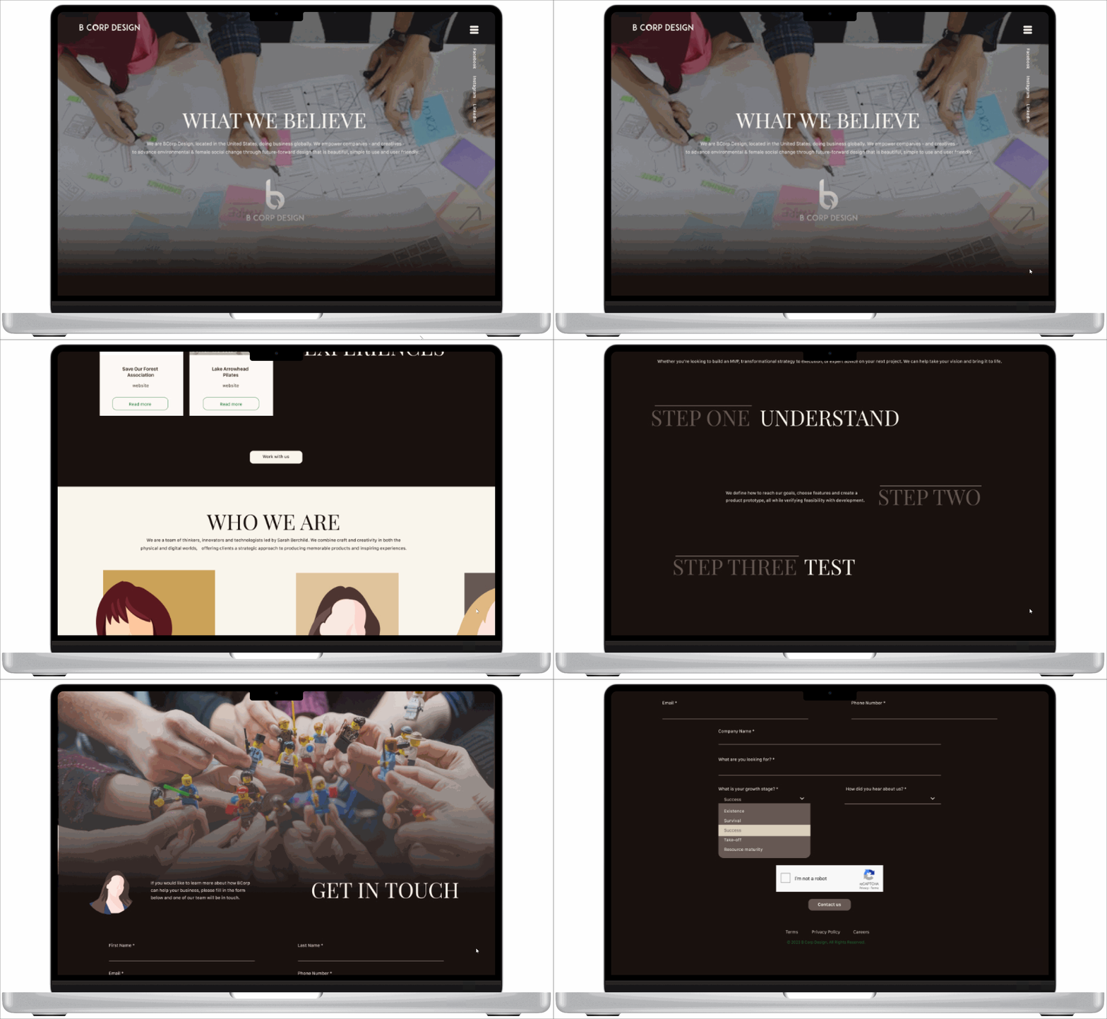
Design A Prototype
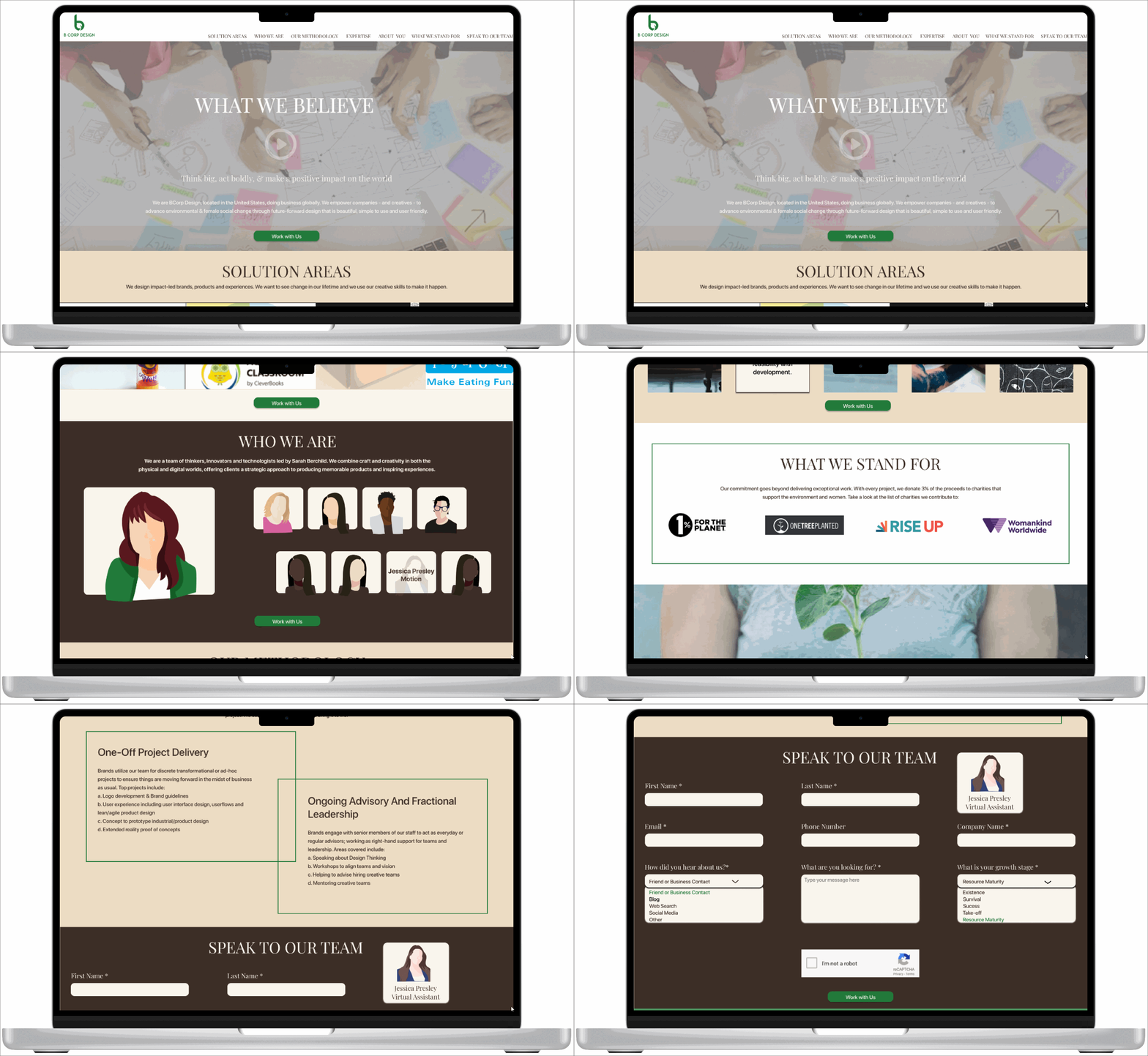
Design B Prototype
Design C Prototype
As the UX writer, I wrote the questions for the A/B testing. The 2 testing agencies we used were Sprig & Maze.
Asked participants to compare three designs.
Investigated what decision-makers look for in a design firm.
Evaluated terminology, layout, color, and user expectations.
Research questions for A/B testing

Survey questions
Testing Results
Terminology Affinity Map
We wanted to determine what others thought of our website and used this to brainstorm ideas for Purpose’s voice and tone.
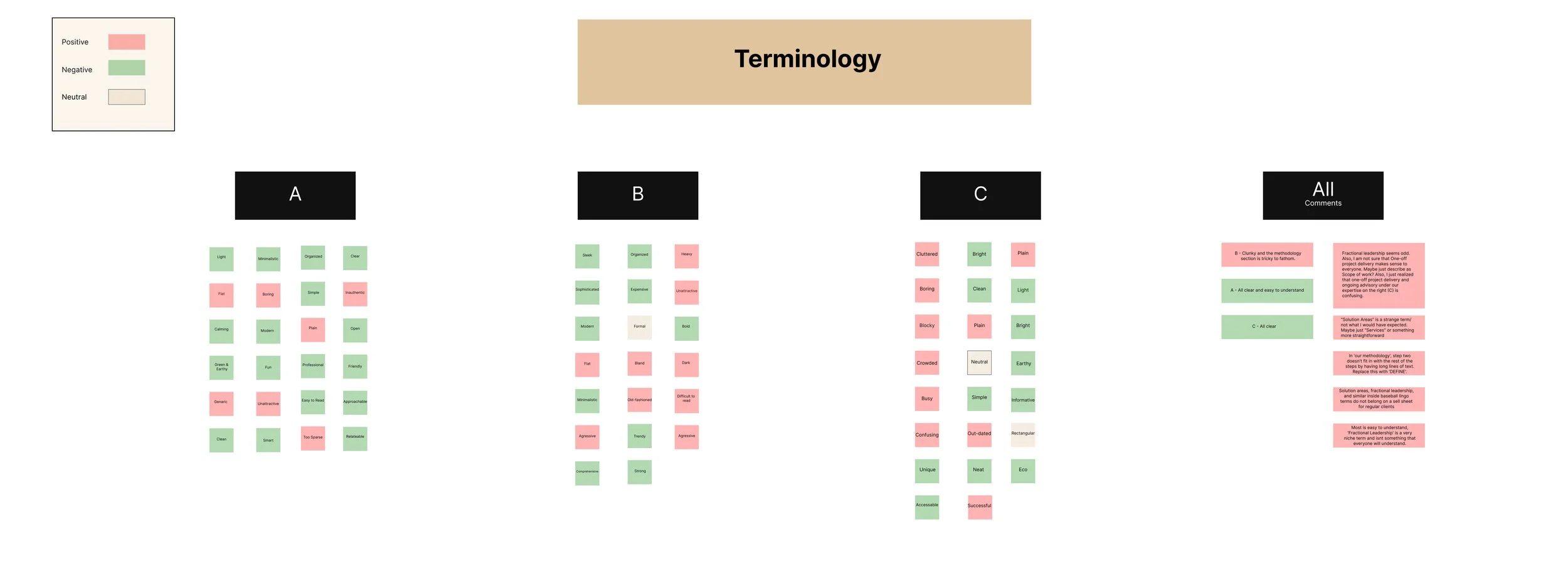
Terminology Affinity Map
A/B testing results
Design A
Problems with Design C
A bit boring and plain.
Too many images and too much squeezed into a small space.

Design C
Positive words describing Design C
Successful
Perfect
Simple
Bright
Unique
Accessible

Positive words describing Design A
Light
Calming
Organized
Easy to read
Professional
Fun
Problems with Design A
Wording felt inauthentic.
Colors were boring.
Layout was flat.
Design B

Positive words describing Design B
Bold
Modern
Sleek
Trendy
Strong
Sophisticated
Problems with Design B
Design was too dark and difficult to read.
Color was too aggressive.
Layout felt "old-fashioned.”
Favorite design
Participants chose their favorite overall design.
The subjects were very polarized in their opinions of the designs.
Results were evenly distributed amongst the designs.

UX Copy

Final Contact Form
Reduced friction for a better experience
Improvements to be implemented
Redesign the landing page based on the positives of each design and remove the negatives. Combine the best parts of each design (A, B and C) into one landing page.
Solution Areas (design A): Choose easy to understand language, polish it.
Who We Are (design C): Less scrolling and change to a concise layout.
The Methodology (design C): "Publishable" and "perfect" because of the clear language. Use this language.
What We Stand For (removed): Relocate to another page on the website for simplification.
The Get in Touch form (design B): The simple, clear, and concise content and design will be pared down further.
Projects (reworked): Remove fluff and unnecessary text.

Learnings
I learned a lot from this project!
How to design on a tight deadline with a team of many different personalities. It was so exciting! I loved being part of a team.
Honed my UX writing skills, specifically, tone and voice, buttons, drop-down and form creation.
Improved my presentation skills by presenting to stakeholders, gathering feedback, and iterating to find the right combination of content and style.